
Sidebar
additional_functionality:viewing_images:viewer_keys_and_toolbar
Viewer Mouse, Keys and Toolbar
By default, the main mouse and keyboard controls for the standalone viewer are as follows:
- Scroll the image: Drag the image around with the left mouse button, or use the cursor keys. While dragging with the mouse, hold Ctrl to toggle between 1:1 scrolling and accelerated scrolling.
- Drag the image to another application: Using the left mouse button, click and drag the window icon (top-left of the titlebar) and drop it on another program which accepts image drops (e.g. most image editors).
- Select part of the image: Using the left mouse button, hold the shift key and then click and drag over the image to create a selection rectangle. While dragging to resize the selection, you can hold Space to move the whole rectangle and adjust its starting point. With a selection defined, you can use Ctrl-C to copy that part of the image to the clipboard or Ctrl-R to crop what the viewer displays. (Note: If you use Ctrl-C without a selection then it will copy the entire image to the clipboard, so you don't have to Select All first.)
- Toggle additional information about the image: Push F10 and information about the image will appear in the bottom right. Push the same key again to hide it.
- Toggle slideshow mode: Push the S key. The current list of images will be cycled through on a timer.
- Toggle full-screen mode: Click the middle mouse button or push Alt-Enter.
- Next or previous image: Turn the mouse wheel or push the Space and Backspace keys.
- Delete the current file: Push the Delete key.
- Zoom in and out: Push = and - on the main keyboard, or + and - on the numeric keypad. You can also hold Ctrl and turn the mouse wheel.
- Reset to original size (100% zoom): Push O (letter-O) on the main keyboard or * on the numeric keypad.
- Set to specific size (25% to 800% zoom): Push Ctrl-1 through to Ctrl-8, on the main keyboard, for various zoom presets.
- Fit to window: Push F. Large images are reduced if too large for the window, but images are never enlarged. (Aspect ratio is always preserved.)
- Grow to window: Push G. Large images are reduced to fit in the window; small images are enlarged to fill the whole window. (Aspect ratio is always preserved.)
- Rotate the image to the left: Push L.
- Rotate the image to the right: Push R.
- Rotate to a specific position: Push 1 (90 degrees), 2 (180 degrees) or 3 (270 degrees). Push 0 (zero) on the main keyboard or numeric keypad to reset the image's rotation.
- Flip the image horizontally: Push H.
- Flip the image vertically: Push V.
- Toggle a white background: Push Shift-W.
- Toggle a black background: Push Shift-B.
(The default background color can be changed in Preferences, but it can be useful to change it on-the-fly when viewing images which use transparency. Not all plugins support changing the background color in this way.)
There are several other actions and hotkeys which you can find via the menu at the top of the viewer:
- File: The File menu contains commands to open a new image, save the current image (useful when you have cropped it, or want to convert it to a different format). You can print the current image, and launch the Image Conversion function to convert, resize or rotate the image.
- Edit: Contains some simple file-manipulation commands (Copy, Move, Cut, Delete). You can also copy the image (or a selected portion of the image) to the clipboard for pasting into other applications. It is also possible to crop the image to the current selection.
- View: Contains commands that let you modify the appearance of the viewer window. You can also rotate and zoom in and out of the image, apply gamma correction, override the normal background color, and selectively disable the alpha channel (if any). There is also a Full Screen command to display the image in full screen mode, and the Show Information command displays information about the image file in an overlaid tooltip.
Ctrl+Tab can be used to shift the input focus between a field in the metadata editor and the main viewer.
Editing Viewer Toolbar and Keys
The toolbar and context menu in the standalone image viewer are fully configurable, just like all the toolbars and menus in the Lister. Additionally, you can create hotkeys that are only active in the viewer.
To edit the toolbar in the viewer, simply select the Customize Toolbars command from the Edit menu, just like in a Lister. The viewer context menu can be edited from the Context Menus tab in the Customize dialog, and you can also create viewer-specific hotkeys on the Keys tab.
The default viewer toolbar is called Image Viewer, but you can select another toolbar to use from the Viewer / Appearance page in Preferences. You might want to do this if, for example, you want to create your own toolbar but leave the default toolbar unchanged.
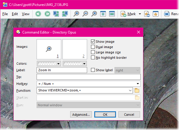
All the internal functionality of the standalone viewer is accessed using the Show VIEWERCMD command. This commands only work from a viewer toolbar, menu or hotkey – they will have no effect if you try to run them in a Lister. You can see from the above screenshot that the command corresponding to the Zoom In function is Show VIEWERCMD=zoom,+. A full list of VIEWERCMD commands is shown in the Show command reference section.
Although the Show VIEWERCMD command only works inside the viewer, this doesn’t mean it’s the only command that does – all other Opus commands and external functions also work inside the viewer. Of course, some commands (for example, Select) are not applicable to the viewer, but it’s certainly possible to use commands like Copy or Rename, or have buttons that open the current picture in, say, Photoshop.
The @if directive can be test the state of various Show VIEWERCMD options when used within the viewer. For example, the following function would toggle between 100% zoom and Grow To Window modes:
@if:Show VIEWERCMD=zoom,reset
Show VIEWERCMD=zoom,grow
@if:else
Show VIEWERCMD=zoom,reset
See the Command modifier reference section for more information about @if command testing.
The behaviour of the mouse wheel and mouse buttons can be changed via Preferences. For example, you can make the left mouse button advance to the next image or close the viewer if you prefer.
Bottom control bar
The optional control bar at the bottom of the viewer is the same as the one in the Viewer Pane - it contains buttons for commonly used functions. You can enable or disable it using the View / Control Bar command. Unlike the main toolbar at the top of the viewer, this one can't be edited.

From left to right, the buttons are Previous File ( ), Next File (
 ), Rotate Left (
 ), Rotate Right (
 ), Zoom In (
 ), Zoom Out (
 ), Original Size (
 ), Fit To Window (
 ), Grow To Window (
 ), Hex View (
 ), Slideshow (
 ), Full Screen (
 ), Print (
 ) and Settings (
 ).
).
Window Menu
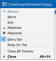
The standalone viewer's Window Menu has a few extra options in addition to the standard ones Windows includes:
- Menu Bar: Toggles the viewer toolbar. This is one way to get it back if you've turned it off.
- Keep On Top: (Opus 13.4.2 and above.) Makes the viewer always on-top, so it will not go behind other windows which are active unless they are on-top as well. Note that opening Preferences or Customize will reset the window to normal, to ensure the dialogs do not open behind it. Also, full-screen viewers are inherently on-top when active, regardless of this setting.
- Close All Viewers: If multiple standalone viewers are open, this command will close all of them at once.